How I Create Better Visuals: 29 Design Styles Every Creator Should Know
A lot of people ask me how I make my visuals. Here’s my actual process, from collecting references and using ChatGPT to choosing the right design style and keeping every visual clean.
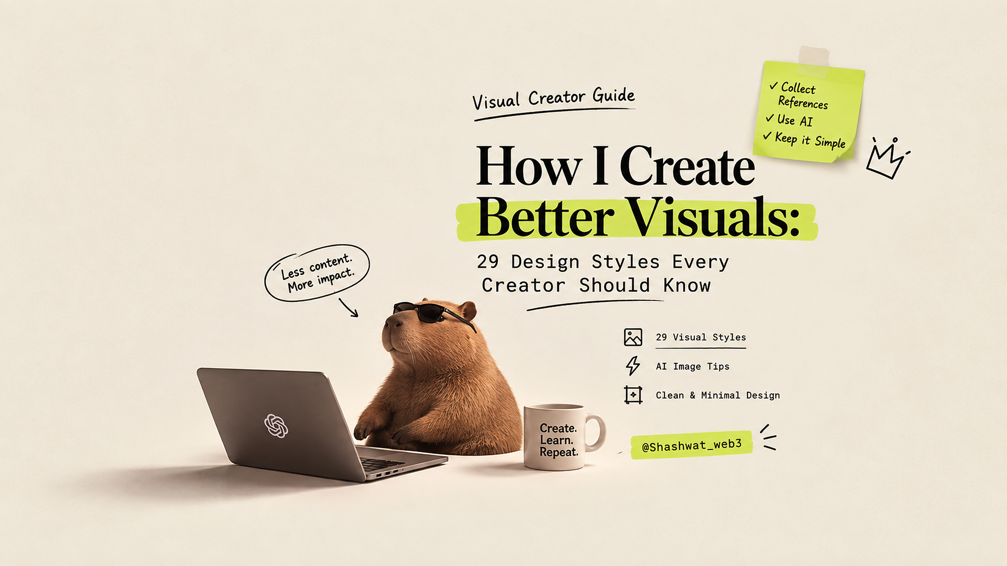
A lot of people ask me:
"How do you make such cool visuals?"
Honestly, there isn't one secret prompt or one tool that magically makes everything look good.
Most of it comes down to having a good eye for references, understanding visual styles, and knowing when to stop adding things.
Here's how I personally approach it.
1. Start collecting references
Whenever I see a visual that catches my attention, I save it.
It could be a poster, website, magazine cover, Instagram post, animation, advertisement, movie frame, or even a random graphic I found online.
I don't necessarily save it because I want to copy it.
I save it because something about the visual works.
Maybe it's the typography.
Maybe it's the layout.
Maybe it's the use of empty space.
Maybe it's the colors.
Maybe it's just the way everything feels together.
Over time, these references become your visual library.
And that library becomes extremely useful when you need to create something new.
2. Don't just collect images. Understand why you like them.
This is probably one of the biggest things I've learned.
When you save a good visual, ask yourself:
- What caught my attention?
- How is the text positioned?
- How much empty space is being used?
- What is the main visual?
- How many colors are being used?
- Is the design minimal or information-heavy?
- What makes it feel premium?
- What makes it feel playful?
- What makes it feel futuristic?
You don't need to become a professional designer to start noticing these things.
You just need to start paying attention.
3. I personally use ChatGPT for images
For most of my visuals, I use ChatGPT to generate the image.
But I don't simply say:
"Make a cool image about X."
That's usually where generic-looking visuals come from.
Instead, I first decide what I want the visual to communicate.
Then I think about the style, composition, typography, lighting, subject, negative space, and overall mood.
For example:
Instead of:
Create an image about video editing.
I'd think:
Create an editorial-style visual about video editing with a strong central subject, large negative space, restrained typography, subtle grain, and a magazine-cover composition.
The more clearly you understand the visual direction, the better your output becomes.
4. Less is usually better
This is another rule I follow almost every time.
Don't try to put everything on one visual.
A common mistake is trying to add:
- 5 different headlines
- 10 icons
- multiple illustrations
- huge paragraphs
- gradients everywhere
- random decorations
- too many colors
The result usually becomes messy.
I personally prefer visuals with less content and stronger composition.
Give the main idea room to breathe.
If the viewer understands the message in a couple of seconds, you've probably done something right.
29 Visual Styles I Keep in My Reference Library
There are hundreds of visual styles out there.
But these 29 are a great starting point if you're creating social media graphics, posters, thumbnails, presentations, websites, or AI-generated visuals.
1. Minimalism
Minimalism focuses on simplicity.
Think clean layouts, limited colors, strong typography, and plenty of negative space.
Use it when you want the message to feel clear and intentional.
Best for: Educational posts, product visuals, personal brands, clean social graphics.
2. Maximalism
Maximalism is almost the opposite.
More colors, more textures, more elements, more visual energy.
The challenge is making all of that complexity still feel intentional.
Best for: Campaigns, entertainment, music, fashion, expressive content.
3. Swiss Design
Swiss Design is built around structure.
Strong grids, clean typography, alignment, simple shapes, and functional layouts.
It can make even complicated information feel organized.
Best for: Educational content, infographics, presentations, editorial graphics.
4. Brutalism
Brutalism intentionally looks raw and unconventional.
Think oversized typography, harsh layouts, basic shapes, awkward spacing, and almost unfinished-looking elements.
Best for: Experimental websites, culture content, edgy campaigns.
5. Surrealism
Surrealism combines things that normally wouldn't exist together.
A giant object floating in the sky.
A person standing inside a computer.
A city inside a glass bottle.
The goal is to create something unexpected.
Best for: Conceptual posts, storytelling, creative campaigns.
6. Neo-Brutalism
Neo-Brutalism takes the raw personality of brutalism and adapts it to modern digital design.
Bold borders, strong shadows, bright colors, oversized type, and simple UI elements are common.
Best for: Websites, product launches, modern creator content.
7. Neo-Classical
Neo-Classical design takes inspiration from traditional classical art and architecture but combines it with modern layouts.
Think statues, columns, elegant typography, muted tones, and contemporary composition.
Best for: Luxury, culture, history, premium branding.
8. Neumorphism
Neumorphism creates interfaces and objects that appear softly pressed into or raised from the background.
Soft shadows and subtle lighting are the key characteristics.
Best for: UI concepts, product design, interface visuals.
9. Scrapbook
Scrapbook design feels handmade.
Photos, paper textures, handwritten notes, stickers, tape, rough edges, and mixed typography are common.
Best for: Personal stories, lifestyle content, creative posts.
10. Glassmorphism
Glassmorphism uses translucent glass-like surfaces over colorful or blurred backgrounds.
Think transparency, blur, reflections, and soft gradients.
Best for: Technology, AI, fintech, dashboards, futuristic interfaces.
11. Claymorphism
Claymorphism makes objects look soft, rounded, and almost clay-like.
It usually uses chunky shapes, soft shadows, and playful 3D forms.
Best for: Apps, education, playful brands, illustrations.
12. Bento Grid
Bento Grid layouts divide information into organized rectangular cards.
Each card can contain a different piece of information while the overall layout remains structured.
Best for: Product showcases, feature breakdowns, portfolios, educational graphics.
13. Pixel Art
Pixel Art uses deliberately low-resolution graphics made from individual pixels.
It instantly creates a retro gaming feeling.
Best for: Gaming, nostalgia, tech culture, playful content.
14. Conceptual Sketch
Conceptual Sketch uses rough drawings and hand-drawn elements to communicate an idea.
It doesn't need to look perfectly polished.
Sometimes the roughness is the point.
Best for: Explainers, ideas, storytelling, educational content.
15. Luxury Typography
Luxury Typography puts typography at the center of the visual.
Elegant serif fonts, generous spacing, restrained colors, and premium composition are common.
Best for: Fashion, premium products, personal brands, editorial content.
16. Editorial Design
Editorial Design takes inspiration from magazines and newspapers.
Strong headlines, structured grids, photography, columns, captions, and intentional typography are common.
Best for: Articles, educational threads, storytelling, professional content.
17. Y2K Aesthetic
Y2K takes inspiration from late 1990s and early 2000s digital culture.
Chrome effects, futuristic interfaces, bright colors, glossy surfaces, and playful typography are common.
Best for: Pop culture, fashion, nostalgia, technology content.
18. Ethereal
Ethereal design feels dreamy and almost otherworldly.
Soft lighting, haze, glowing elements, translucent objects, and delicate colors create the atmosphere.
Best for: AI, spirituality, fantasy, beauty, conceptual storytelling.
19. Bohemian
Bohemian design is warm, artistic, and organic.
Natural textures, earthy colors, handmade elements, patterns, and relaxed compositions are common.
Best for: Lifestyle, travel, art, personal brands.
20. Dark Mode UI
Dark Mode UI takes inspiration from modern software interfaces.
Dark backgrounds, glowing accents, cards, dashboards, charts, and interface elements are common.
Best for: AI, crypto, SaaS, developer content, technology.
21. Cyberpunk
Cyberpunk combines futuristic technology with gritty environments.
Neon lights, dark backgrounds, glowing signs, dramatic shadows, and high-tech interfaces are common.
Best for: AI, gaming, crypto, technology, futuristic storytelling.
22. Anthropomorphic
Anthropomorphic design gives human characteristics to non-human objects.
A computer that has a personality.
A robot that behaves like a person.
A wallet with a face.
It makes abstract concepts easier to understand.
Best for: Educational content, mascots, brands, storytelling.
23. Victorian
Victorian design takes inspiration from 19th-century visual culture.
Ornamental details, decorative typography, engraving-like illustrations, and intricate borders are common.
Best for: Historical themes, storytelling, posters, premium creative work.
24. Cybercore
Cybercore pushes digital aesthetics even further.
Think futuristic interfaces, distorted graphics, digital textures, glitch effects, and aggressive typography.
Best for: Internet culture, gaming, music, experimental technology content.
25. Synthwave
Synthwave is inspired by 1980s futuristic aesthetics.
Neon colors, sunsets, grids, glowing horizons, retro cars, and dramatic lighting are common.
Best for: Gaming, music, nostalgia, technology, futuristic visuals.
26. Graffiti
Graffiti brings street-art language into the design.
Spray-paint textures, handwritten lettering, stickers, rough edges, and bold colors are common.
Best for: Youth culture, music, community content, streetwear.
27. Gothic
Gothic design is darker and more dramatic.
Black backgrounds, ornate typography, medieval references, shadows, and detailed illustrations are common.
Best for: Music, fashion, horror, dark storytelling.
28. Mixed Media
Mixed Media combines multiple visual formats in one composition.
Photography, illustration, typography, textures, 3D objects, sketches, and digital elements can all exist together.
Best for: Campaigns, creative storytelling, experimental graphics.
29. Wabi-Sabi
Wabi-Sabi embraces imperfection.
Natural textures, handmade objects, asymmetry, muted colors, cracks, rough surfaces, and simplicity are common.
Instead of trying to make everything perfect, the imperfections become part of the visual identity.
Best for: Lifestyle, art, culture, editorial work, thoughtful storytelling.
The real trick
You don't need to memorize all 29 styles.
The point is to build your visual vocabulary.
The next time you see a design you like, try to identify what style it reminds you of.
Then save it.
Over time, you'll start recognizing patterns.
You'll know when a post needs minimalism.
When an idea needs surrealism.
When a product needs a Bento Grid.
When a story needs an editorial layout.
And when a simple visual is better than an over-designed one.
That's what has helped me the most.
Good visuals aren't just about making something look cool.
They're about making the right visual decisions for the idea you're trying to communicate.
And the more references you collect, the better those decisions become.